Creative is no longer just a “nice to have.”
In 2025, it’s a performance tool. A growth lever. And a driver of real business results. But before obsessing over ROAS (return on ad spend) and CPA (cost per acquisition), you need to give another metric the consideration it deserves: Click-through rate (CTR).
Why CTR? Because in a sea of performance metrics vying for your attention, a healthy CTR is the clearest signal that your creative is doing its job. That your message landed, your visual stood out, and your audience cares enough to engage.
But it’s more than that. A high CTR usually also leads to a lower cost per click (CPC) — reducing the cost of every subsequent action down the funnel, like leads, purchases, and sign-ups. In other words: Higher-intent traffic = higher conversion rates (CVR).
Looking to get more clicks with your creative? Then you’re in the right place. This guide is the result of analyzing $17M in ad spend across Ecommerce, B2B, SaaS, FinTech, EdTech, and Nonprofit brands. It’s packed with channel-specific creative tactics designed to help you optimize for CTR and finally turn scrolls into sales. The best part? These tactics are absolutely scalable — so you can start weaving them into your new creative immediately.
Let’s dive in.
Part 1
Ecommerce Creative Strategies and Statistics
Don’t sleep on statics.
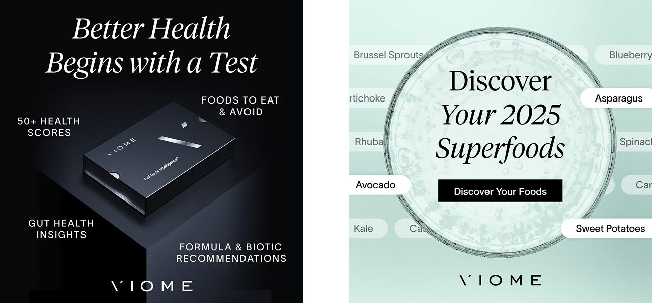
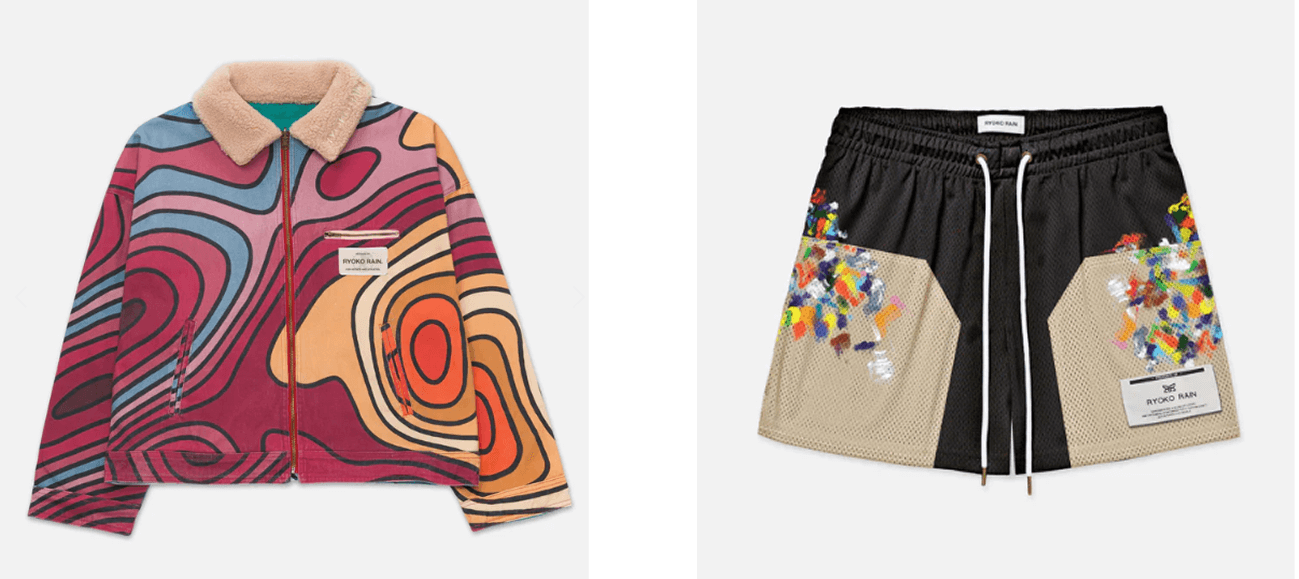
67% of Ecomm ads with a 10% or higher CTR are static or carousel.
Why it works:
Video ads, especially UGC, aren’t going anywhere. But when it comes to driving efficient clicks, statics can be wildly effective. When audiences are warm to your brand or product (oftentimes due to compelling video ads), a quick and clear static graphic can drive strong intent.
What to test next:
- If you’re only running video ads for prospecting, try mixing in static carousels with tightly curated product themes (“Best Sellers” or “New Arrivals”).
- In retargeting, pair clean, product-focused creatives with strong direct-response angles (“Don’t miss this drop” or “Shop Our Most Wanted Styles”).
Intent is higher on Instagram than Facebook.
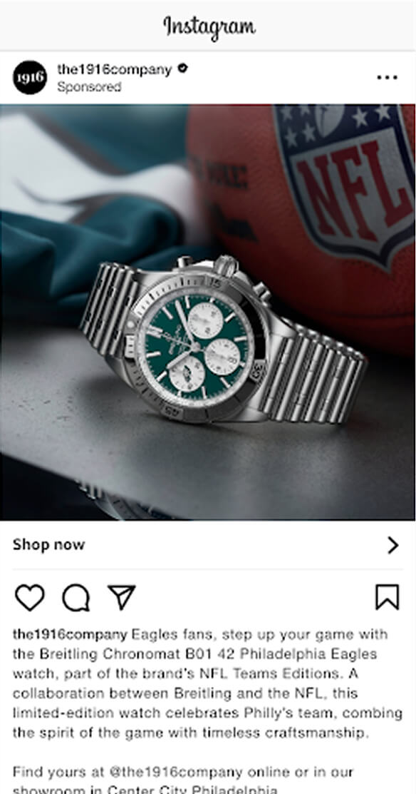
The top 10 ecomm ads ran on Instagram placements (Feed and Stories). CTRs dip slightly when the same campaigns run on Facebook.
Why it works:
The visual style and scroll behavior of IG could be better suited to product-focused, quick-scan creatives.
What to test next:
Prioritize IG Feed for catalog or product feature ads. Use IG Stories more for remarketing or promotion-driven messages, where click intent is higher.
Advantage+ catalog ads can scale, but they aren’t automatic wins.
Several high-performing ads used Advantage+ Catalog Ad format, but it’s not turnkey.
Why it works:
What matters is creative clarity within the feed unit, not just auto-optimization.
How to optimize creative:
Make sure your catalog assets are clean, well-lit, and aligned with your bestsellers. Avoid noisy backgrounds or inconsistent styles. You can’t control much in Advantage+ layout, but you can refine product names, pricing clarity, and feed titles. Make them scannable.
Part 2
B2B Creative Strategies and Statistics
Stop talking about yourself.
Ad creative that lead with benefits drive 31% more efficient clicks than talking about features.
Why it works:
Your prospects want outcomes, not homework. People want to instantly know if engaging with you will make their life better. “Save 10+ hours per week” sounds way more appealing than “AI-powered dashboards.”
What to test next:
- Write ads that show you know what viewers are dealing with.
- Lead with outcomes like ROI, time savings, or error reduction.
- Use real numbers to back up your claims when possible. Once interest is captured, back it up with real evidence.
Stop over-producing your video ads.
Ads with native-looking visuals drove 100% more clicks than polished creative
Why it works:
Lo-fi visuals signal authenticity. Especially on social, B2B audiences engage more with formats that mimic user-generated content, like webcam angles, handheld motion, and unscripted tone. This visual style feels like advice, not a sales pitch.
What to test next:
- Record quick lo-fi videos from team members explaining a use case or workflow. Good is better than perfect here.
- Layer screen-recorded demos and captions over music or voiceover. Some people watch with audio and some without. Your video should be accessible to all user behaviors.
- Don’t open with intros and branding. Get attention first and build trust with your message.
Tell viewers what comes next.
Specific on-asset CTAs (Watch the 2-min demo) receive almost 2x more clicks than generic CTAs (Learn more).
Why it works:
Clear CTAs remove friction. Buyers are more likely to click when they know exactly what’s behind the button. “Learn more” is vague. “See how it works” sets an expectation of what’s to come.
What to test next:
- Swap generic “Learn more” for “Compare pricing”, “Explore integrations”, or “Try the ROI calculator.”
- Match your CTA to the funnel stage: early = exploration, mid = evaluation, late = conversion.
- Always include a clear CTA as part of the actual creative: buttons, overlays, or voiceover.
Part 3
SaaS Creative Strategies and Statistics
Polished ads are too salesy.
SaaS brands with unfiltered, DIY-style visuals consistently drive higher CTRs than pristine, branded content.
Why it works:
Scrappy visuals lower the guard. On TikTok, the more your ad feels like a Slack screen share or a teammate firing off a quick Loom, the more believable it becomes. It doesn’t look like marketing—it looks like someone showing you how they actually get work done. That shift—from production to participation—builds trust fast in a crowded SaaS feed.
What to test next:
Strip back the polish. Test Loom explainers with casual tone from team members.
Show your product doing the work.
Ads that clearly show the product in action drive stronger purchase intent.
Why it works:
SaaS buyers are solution-focused. Once you’ve got someone’s attention with benefits messaging, the next objection to overcome is, “How do I get that outcome?” Showing your product in action is the fastest way to ease reservations about a steep learning curve.
What to test next:
- Create lof-fi dashboard walkthroughs. Don’t get too in the weeds. Function and ease of adoption should be the goal.
- Open with obvious, relatable friction. Then solve it with your product, fast.
Prioritize clear ads over more ads.
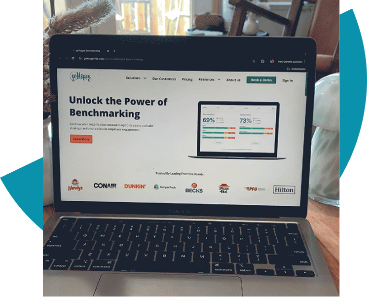
Audiences are up to 90% more likely to click SaaS ads that lead with clarity, not flash. Lean static designs outperformed busy carousels, videos, and GIFs in average CTR on LinkedIn.
Why it works:
Buyers don’t need hype, they need clarity. Interest increases when the mental load is low.
What to test next:
- Slower, simpler formats. Not every ad needs to have all the answers.
- Make the CTA ultra-clear to set expectations early.
- Make sure the value prop is skimmable in 1.5 seconds.
Part 4
Fintech Creative Strategies and Statistics
Use face-to-camera video to build trust with prospects.
Ads featuring an expert talking directly to camera with a clear problem-solution arc consistently outperformed all other video types.
Why it works:
Trust is currency in Fintech. Personal stories, specific results, and real testimonials build trust and reduce friction in a space where skepticism is high and trust is everything.
What to test next:
- Use expert-to-camera video. It doesn’t have to be fancy. Unpolished UGC feel, simple backdrop, and conversational tone actually tend to reduce skepticism.
- Get weird with the format. Use platform-native trends like duets, stitches, and comment replies.
Show, don’t tell.
Ads using a before-and-after transformation angle see up to 40% more clicks than other angles.
Why it works:
Financial products often take time to show value. Simulating fast transformation builds confidence with prospects.
What to test next:
- Validate with static and carousels that clearly contrast pain points and solved states.
- Once there’s traction, weave this into video ads as proof points after an engaging hook.
Be specific.
Using bold numbers leads to higher CTRs in the Fintech space. Use numbers over generic claims as much as possible.
Why it works:
Generic claims don’t overcome objections. They increase skepticism. Use bold stats as often as possible to show real value in your product, even if it’s incremental.
What to test next:
- Lead with a number.
- Test bold typographic static ads.
- Back bold claims with data.
Part 5
EdTech Creative Strategies and Statistics
Solve the problem in less than 3 seconds.
EdTech ads that immediately pose a problem and hint at a solution (Struggling with calculus?) drive up to 40% more efficient clicks than ads with slower build-ups.
Why it works:
Learners respond to relevance. Leading with tension (their struggle) and relief (a clear outcome) gives them a reason to keep engaging with the ad.
What to test next:
- Pain-first (Dreading your final?) vs benefit-first (Head into finals confidently) hook variants.
- Make problem-solution copy front and center.
- Allude to a solution directly after the hook to position your product as the answer.
Tell a transformation story, not just a testimonial.
First-person before-and-after ads, especially UGC-style, had up to 50% higher CTRs than branded testimonials.
Why it works:
Audiences trust stories that sound like their own. Real learners talking about their growth builds connection and belief, reducing friction in the customer journey.
What to test next:
- UGC confessionals with a story arc: “I was → Then I tried → Now I”.
- Use real metrics: test scores, progress bars, weekly goals.
- Native-feeling footage. Phone footage is more relatable than high quality video.
Fluff doesn’t move the needle.
Abstract brand messaging (e.g., “Empowering future minds”) consistently falls flat compared to authentic, narrative-driven copy.
Why it works:
Generic vision statements don’t answer “What’s in it for me?” fast enough. Clarity always wins.
What to test next:
- Rewrite brand-led intros to focus on outcomes. Position your viewer as the hero, not your brand.
- A/B test value props (Flexible online classes vs Finish your course in 4 weeks) using multiple variations of each.
- Build CTAs around approachable action, not aspiration.
Part 6
Nonprofit Creative Strategies and Statistics
Share real stories about real people.
Ads featuring authentic human storytelling drive nearly double the clicks than conceptual language and stock visuals.
Why it works:
People respond emotionally to real faces and personal narratives. For nonprofit causes, where trust and empathy are required, human stories outperform brand clout every time.
What to test next:
- Interview-style video with close-ups of speakers.
- Short montages of real beneficiaries or volunteers sharing impact.
- UGC-style testimonials.
Make the viewer the hero.
Ads that address the viewer directly drove up to 40% more clicks than those org-centric framing.
Why it works:
Making the viewer feel personally capable of helping taps into the natural desire to make a difference. It shifts the message from “we do good work” to “you can do good.”
What to test next:
- Reframe CTAs from org-centric (Support our mission) to viewer-centric (Help a student get to college).
- Use “you” language in both copy and voiceover to make the viewer feel part of the story.
Clear CTAs build confidence.
Nonprofit ads with explicit asks (Donate $10 now) see higher CTR and lower drop-off than softer, exploratory CTAs (Learn more).
Why it works:
People want to help but they need a clear action path. Vague or indirect asks can feel like a bait-and-switch, especially in paid placements. Being clear about what you want the viewer to do isn’t salesy. It sets expectations.
What to test next:
- Use dollar-specific CTAs (Give $25 to send one student to school).
- Show what donor dollars are able to do.
- Test aggressive CTA framing early vs. at the end of messages.
Make Your Creative Work for You
No matter the industry, the strongest ads had a few things in common:
- Clarity beats cleverness: Strip the fluff. Lead with value. Test bold headlines, outcome-first copy, and CTAs that say exactly what happens next.
- Real is better than refined: Try native-feeling creative: selfie videos, screen shares, and handmade drawings. If it looks like content your audience already engages with, it gets clicks.
- Specificity builds trust: If you can’t show or measure it, people won’t believe it.
- Your format isn’t the problem, your message is: Don’t toss a format just because it flopped once. Focus on what you’re saying, not just how you’re saying it. Then test again with tighter copy and clearer value.
This guide doesn’t tell you the one perfect creative for your brand. Instead, it shows you where to look. Use these patterns to sharpen your briefs, simplify your messages, and prioritize what’s likely to move the needle.
Start with one idea. Test it. Scale what sticks. Cut what doesn’t. That’s how your creative becomes a growth engine and not a guess.
Ready to grow?
Your compounding growth curve begins here.
